However they had been looking for a piece to go in their Living Room which was completely different colours. As many of you know this is my forte.... designing pieces the right design, size, shape and colours for a room.
I suggested that I make a visit to there home where I could see the room and wall where they would like a painting. This allows me to advise on the perfect size and shape. See the colours of furniture, wallpaper and soft furnishings and formulate a design idea and colour palette in my head.
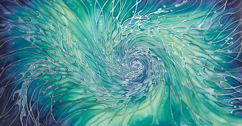
Curious if the piece above would fit elsewhere in their home I took it along on the home visit, with the added bonus that it would be a visual aid to the best size and shape for the space.
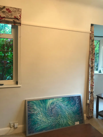
This was wall space. It was calling out for a long portrait piece, which would break up a lot of horizontal lines in the room and echo the shape of the space and bay window curtains.
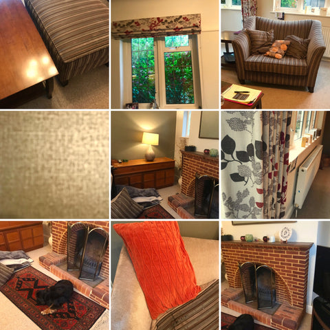
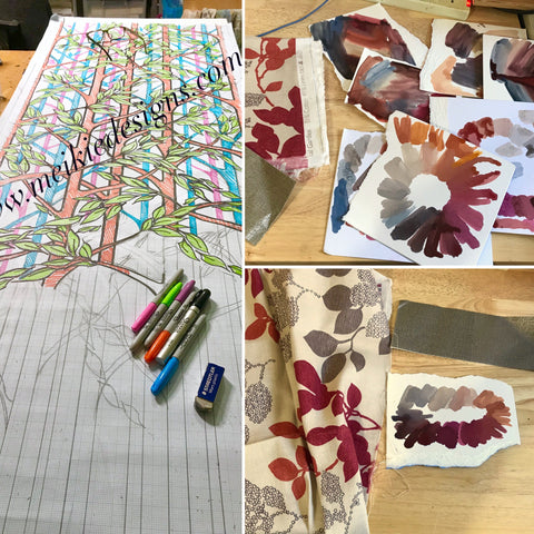
I photographed all the furniture, soft furnishings, fire place, wallpaper and rug so I had colour and design references for the piece.
As you can see the chair has a stripe to it and along with the leaves in the curtains I thought of this piece from a few years ago called 'Into the Woods', which I have used in repeat here on a blind.
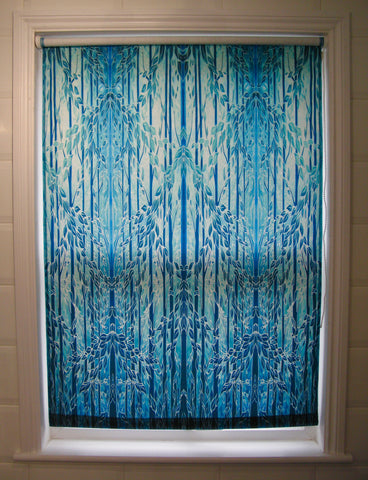
I showed John and Samantha this picture and they agreed that it echoed the stripes and leaves well and would also suit the size and shape we had decided on.
So I costed it up and the order was agreed.
I set to work designing the piece and mixing and testing the paint colours until I was completely happy the balance was right. I then sent these by email to John an Samantha to check they liked them.
Then the most enjoyable part for me outlining the piece and painting. As the design called for both warm colours and cool colours I used a mixture of gold, copper and silver outliners, which also gave the piece more movement and interest. As I started painting I realised how I thought I was going to paint it changed. I paused for a day and came back to it. I found that the foreground and the background colours wanted to swap back and forth with each other creating more depth which draws you in and moves your eye around the painting.
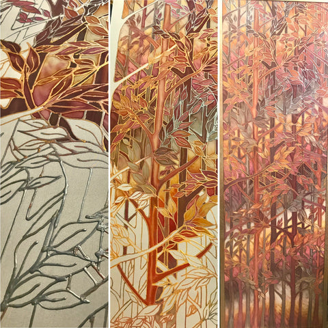
I painted a simple frame with mottled silver, copper and gold to blend beautifully with the piece. Framed it up and delivered the painting in person.